


Coming up with your first ever business card can be challenging to say the least, but is at the same time every bit as important as it is exciting. Seeing your name emblazoned on such an iconic piece of card to hand to those you’d like to do business with is something of a rite of passage for all up and coming business types, who will of course be looking to make a good first impression and the right lasting impression from then on.
However, hitting the nail on the head with business card design isn’t as easy as randomly throwing some words on a card and hoping for the best. There’s a hell of a lot more to it that is often assumed, which is precisely why tens of thousands of business cards are printed each day when the only place they’ll ever end up is the bin.
So, in the spirit of avoiding an untimely demise for your own business cards, here’s a quick overview of a few important tips for getting it right from the experts at e-printing.co.uk:
1 – Simplicity Sells
Right off the bat, just because you have a blank canvas in front of you doesn’t mean you have to create a complicated masterpiece. When it comes to business cards, it’s generally fair to say the most impressive and generally executive-looking business cards are those that feature almost nothing at all except the name of the card’s giver. It’s a bit like saying ‘You should know who I am already because I’m so great and important’ rather than using the card itself to try and sell yourself with your life story.
Of course there’s always something to say for including your brand logo, contact details and anything else that’s 100% mandatory, but on the whole it’s important to remember that simplicity sells.
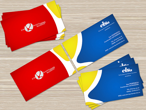
2 – Standard Size
One of the most common approaches to business cards these days by those looking to stand out from the crowd is to create cards of an unusual shape or size. This immediately gives the card a certain degree of impact and makes it much easier to recognise, but at the same time there’s a very good reason why 99.9% of successful business types don’t follow suit…non-standard cards don’t tend to fit in wallets, rolodexes and other standard office staples.
Form does indeed count for something and standing out from the crowd matters, but not to such an extent that you should begin messing around with global size and shape standards.
3 – Quality Counts
More often than not, what sets one business card on a much higher plane than another is not what it says, but the way it is presented. The simple truth is that anyone with a home printer and a wad of paper can print their own business cards for next to nothing, but the results of doing so are never going to be anything to be proud of. By contrast, take your order to a professional printing house and you can insist on the most stunning quality materials and printing on the market.
You only get one chance to make a first impression, so make it a first impression of quality.
4 – Stick to One Side
If you are making a business card that’s to be given personally to clients, peers and other businesses in general, it’s a good idea to stick to just one side of the card. The reason being that the moment you start adding content to the back of the card, it starts to look more like a small promotional leaflet than an elegant business tool.
Of course, if on the other hand you simply want to advertise your company and leave hundreds of cards around all over the place for people to pick up at random, it’s more than appropriate to go two-sided. Think about what it is you want to say and who you’d like to say it to.
5 – Colour Choices
Last but not least, it’s important to be careful and strategic when it comes to the colours you choose for your business card as you neither want to fade into the background nor stick out like a sore thumb. Choosing coloured cards can be a great way of giving your business card that little extra sparkle, but at the same time only if the colour chosen is appropriate for your brand and your line of business.
If you’re looking to sell pension schemes for example, bright pink with sparkly glitter may not be the way to go!
