


Some would argue that there’s no such thing as the ‘wrong’ way to go about designing a display board for a trade show or expo, though this is in fact pretty far from the truth. While there’s no specific example of a board that’s just plain wrong on all fronts, it’s actually quite easy to go barking up entirely the wrong proverbial tree for your own business…any business, in fact.
The problem in many cases is that those coming up with the board designs don’t put enough thought into making their boards a true and accurate reflection of their brand as a whole. They lose sight of who they are, what they do and what it is they stand for, resulting in a first impression that’s entirely removed from that they were striving for.
What follows is a quick eight-point guide to the most common ways and means to ruin both your trade show display boards and your chances of winning over your target audience:
1 – Going Too Big
First of all, to assume that ‘bigger is better’ each and every time is to steer yourself down entirely the wrong path. If you’re a huge business with a ton to say and have the kind of output that facilitates a giant stand with towering display panels, so be it. However, if you’re a smaller business with a simpler message to share, chances are it’ll get totally lost if you go for boards that are way too big. Think what you need to say and the space you need to say it, and don’t be tempted to go much bigger.
2 – Going OTT with Color Choices
Colours can be great for bringing in the attention of those passing your standby, but must be selected in accordance with your brand only. If, for example, you supply office furniture and have a brand logo coloured brown and black, it’s not really going to speak for your brand if you advertise your stand with neon orange and green signage. With colours, it’s not only about avoiding actual colour clashes, but also clashes with your own brand in general.
3 – Overcrowding
Something else to be aware of is how easy it can be to end up totally overcrowding your boards unnecessarily. There will always be those for whom any white space at all is pure evil and must be eradicated. And when this is the way of thinking, it becomes a case of using anything possible to get rid of white space and ensuring every last inch of the board is used up. The result will almost always be a sense of overcrowding where the most important messages and content are totally drowned out.
4 – Unclear Emphasis on Important Elements
Speaking of the message being drowned out, another common mistake that really can kill a display board is that of not making it abundantly clear what the primary message is. It’s easy to forget that those encountering your brand for the first time may not have a clue what exactly it is that you do, which in turn makes it crucial to appropriately highlight and single out the most important messages of all in a manner that’s clear.
5 – Information Overload
Too much of a good thing is never a good thing – in this instance, the rule applies to your content in general. Your boards should be used to capture the audience’s attention and pique their interest in your brand, as opposed to conveying your whole life story and working ethos.
6 – An Unclear Message
It can be tempting to get a little cryptic with display boards and if you pull it off successfully, it can be very effective. However, when using anything like a riddle or a ‘clever’ play on words to get across what it is that you do, you have to be aware of the fact that a fair chunk of those reading it might not in fact have a clue what you’re talking about. Can you afford to take the risk associated with an unclear message?
7 – Poor Use of Humor
In exactly the same way, humor can be a very powerful tool indeed, but only if you get it 100% right. It’s a great way of bolstering interest in what it is you do and building your reputation from the first moment of contact, but if you end up misfiring with your attempt at humor, there’s a good chance your reputation will take a severe turn in the opposite direction. As such, it’s an area to approach with extreme caution.
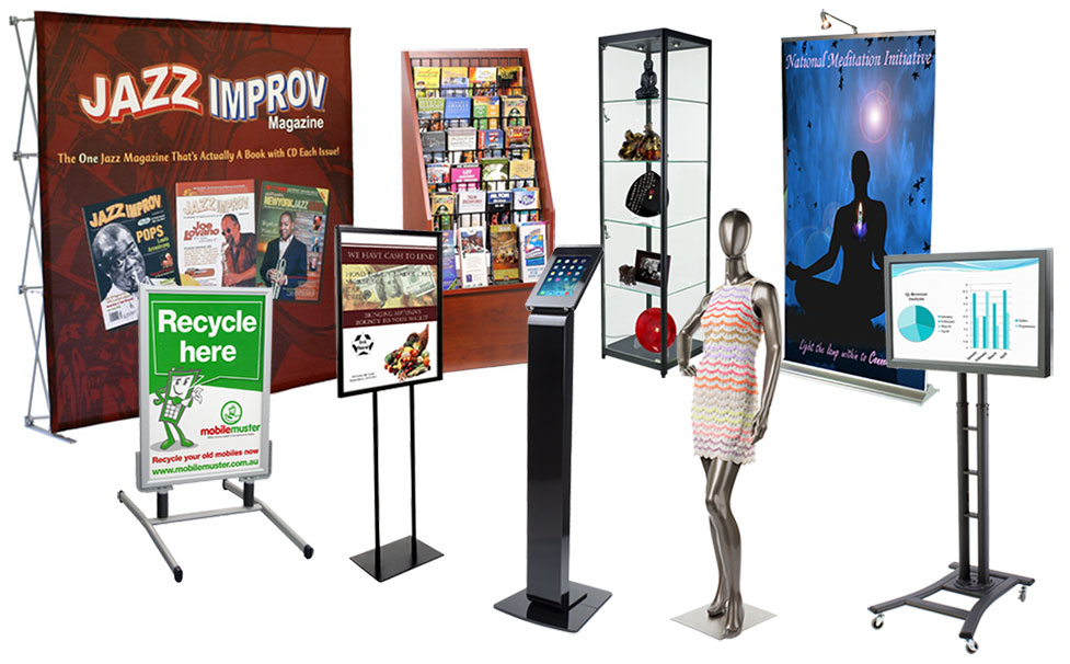
8 – Lackluster Equipment
Last but not least, nothing can dilute the appeal of an otherwise fantastic trade show stand quite like lackluster hardware that just screams corner-cutting and laziness. If you’re going to take the time to design great boards and put your all into a trade show appearance, at least do your business the courtesy of investing in the best quality boards, frames, stands and so on.
