It’s often assumed that the secret to high impact display and presentation boards is making them as loud, bold and brash as possible. Sadly, while this may indeed have some kind of impact on the board’s intended target audience, it isn’t necessarily the kind of impact that bodes well with its purpose. After all, it’s one thing to capture the attention of a passerby, but it’s another entirely to capture it for all the right reasons and then hold onto it.
Whether you’re looking to set up display boards around the office, at any kind of business expo or even just out on the streets as part of a marketing drive, there are certain rules that ring true in all instances. So, when the time comes to design your own displays and decide what to do with your display boards, consider the following five golden rules and you’ll be on your way to a successful outcome:
1 – Less is More
First of all, the ‘less is more’ rule is one that applies to so many different areas of marketing and advertising – this being no exception to the rule. The whole point of a high-impact display board is that it should be able to not only grab a person’s attention, but also get the relevant message across to them in the shortest time possible. When walking by a display board or poster, chances are you’ll spend no more than a few seconds looking at it during which time you’ll know what it’s about or be left none the wiser. Avoid the temptation to put too much into it content-wise, as less can often be more.
2 – Content Hierarchy
With just a few seconds or even a split-second to get your message across to the reader, you need to make it as clear as possible which parts of the content are of the most importance and what’s more of a secondary element. This is achieved by following the rule of content hierarchy, which is actually a very simple common sense rule most follow without even thinking about it. In a nutshell, your primary point/message needs to be largest and given the most attention, followed by smaller fonts and images used for side issues and content of less importance.
3 – Natural Focus
Also worth bearing in mind (especially when looking to grab the attention of audience members in motion) is the way in which we’re all somewhat predisposed to focus on certain areas of any given board or poster first and foremost. For example, in the West it’s the norm to read from left to right and from top to bottom, which is why when we look at a poster or image, we gravitate toward the top and the left first. As such, it’s a bit of a no-brainer to state that if you were to decide to put the most important message of all in the bottom right-hand corner, chances are it would be completely missed by most.
4 – Show Them the Way
It’s all well and good gaining the interest of your audience members with a great display board or poster, but unless you show them what they need to do next, it’s all quite pointless. If, for example, you were looking to advertise an event, you need to give them the name of the event and its dates above and beyond everything else. Likewise, if you’re a brand or business looking for new customers, you need to get across the name of your brand and some way of finding out more – a website address, physical store location or telephone number, for example. It’s a case of instead of just saying “Hi, we’re great!” going one step further to say “Hi, we’re great and here’s where you can find out more!”
5 – Quality Hardware
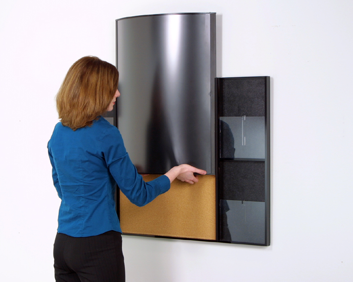
Last but not least, there’s nothing more off-putting or indeed low-impact than a poster that’s clearly been thrown together for the lowest price and run off using the lowest quality hardware. If for any reason the viewers of your board get the idea you’ve cheaped-out on the whole thing, it’s going to be very difficult for them to have any real time or respect for what you have to say. High quality display boards and marketing hardware like this aren’t the most expensive assets in the world, but the impact they have can be huge. So, for the sake of making the right kind of first impression, do yourself a favour and invest in quality gear.


